Wednesday, March 16, 2011

Final Project


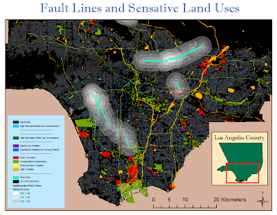
Sensitive Land Uses and Proximity to High Earthquake-Risk Zones


Introduction:
            Since the large earthquake in Japan and the dramatic effects of this natural disaster, the United States must strive to make its major cities more prepared to handle such a crisis. Los Angeles has many risk factors in common with Japan, including highly populated coastal cities, a position near an active fault, and a downtown area with many skyscrapers and tall buildings. However, unlike Japan, California’s building laws concerning earthquake preparedness are much less strict, which could put thousands of Los Angeles residents at risk. There are several land use types that are especially vulnerable to earthquakes and any resulting disasters (tsunamis, fires, landslides): heavy industrial sites, utility and communication facilities, transportation infrastructure, skyscrapers, high-rise apartments and condominiums, schools for young children, correctional facilities or prisons, and special care facilities for the elderly or handicapped. These urban land uses are classified as high risk due to the susceptibility of the structure or because of the individuals that inhabit these facilities.
            Although earthquakes can affect a region within 100 km of the source, the most severe damage takes place within a few kilometers from the epicenter. Two common strategies of predicting future earthquakes involve the location of fault lines and the positions of past earthquakes epicenters. Therefore in order to protect vulnerable land uses from future earthquakes, spatial analysis can be used to map high-risk earthquake zones and land uses and thereby determine which facilities are at the highest risk and should be relocated.
Methods:
In order to perform this spatial analysis, several techniques were utilized using ArcGIS. First of all, past earthquake epicenters and major fault lines were plotted on a map of Los Angeles County. This data was retrieved from the National Atlas and U.S. Geological Survey (USGS). Buffer zones were created around these features in order to represent the area of greatest damage if an earthquake were to occur there.
Secondly, extensive land use data was obtained from the Southern California Association of Governments (SCAG). This data was reclassified according to different classes of land uses and those that were identified as being particularly vulnerable to earthquakes were highlighted, while the rest of the land uses that had a lower risk were made transparent. The color scale (rainbow order from red to purple) assigned to these different land uses corresponds to the severity of the risk. For example industrial land uses such as heavy industrial, utility and communication facilities, and transportation infrastructure were rated as the highest risk (red to green). Land uses that included tall buildings like skyscrapers and high-rise apartments and condominiums, also have a high risk (green to blue) simply due to the precarious nature of their structure. Finally land uses such as schools, special care facilities, and prisons are considered a relatively high risk (blue to purple) because the individuals that are concentrated in these facilities are especially vulnerable.


Results:
 

The result of this study yielded valuable information on the locations of sensitive land uses in relation to earthquake prone areas. There were several heavy industrial areas (red features) that intersected with the earthquake risk zone near Carson, Whittier, Culver City, Montebello, and Covina. Utility facilities (orange features) near Monterrey Park, Sierra Madre, and Avocado Heights were in the risk zone but these represented a very small area. Communication facilities (yellow features) were barely visible on the map, so it is difficult to determine the extent of potential damage to these land uses. Transportation infrastructure (light green) was most at risk near Long Beach, Carson, downtown Los Angeles, and Hacienda Heights. High-rise buildings and skyscrapers (dark green and light blue features) near downtown Los Angeles and West Hollywood were in earthquake risk zones. Educational institutions (dark blue features) for young children were widely dispersed throughout the county and existed in every buffer zone on the map. Special use facilities (purple features) near Santa Fe Springs and South Gate had the most area inside the risk zones, but there were many smaller facilities spread out across the map.


Discussion:
Reflecting on the aftermath and the continuing crisis in Japan it is clear that earthquake-prone regions like Los Angeles must prepare for the worst case scenario in order to avoid as much destruction as possible. After mapping vulnerable land uses for Los Angeles County it is clear that these land uses follow different trends in parcel size and dispersion. For example, heavy industry and transportation infrastructure are concentrated in large areas while schools and special care facilities have smaller areas and are highly dispersed. This represents a challenge in creating a universal solution for protecting earthquake-sensitive land uses; therefore each land use requires its own unique analysis.
By definition heavy industrial land uses include manufacturing, petroleum refining and processing, major metal processing, chemical processing, and mineral extraction. Although most of these industrial facilities are constructed with strict regulations and high safety standards, the entire region relies on their services and purposes and a malfunction could lead to a dangerous situation. For example, despite Japan’s strict safety regulations for nuclear reactors, the recent earthquake led to a malfunction in the cooling system that created a dangerous environment for workers and local residents. Therefore, this specific land use should be moved outside all earthquake risk zones in the hope that these heavy industrial plants can withstand earthquakes at a farther distance from the epicenter.
Similarly to heavy industry, utility facilities tend to be concentrated into large areas and are easily identifiable on the map. Utility facilities include electrical power, waste disposal, water storage, natural gas and petroleum, water transfer, and improved flood waterways. Although this land use has less potential to cause a major disaster like the nuclear reactors, these utilities are essential to keeping the city running especially following a natural disaster. Often many of the deaths following a natural disaster are due to a lack of water and electricity, necessities that aid survival. Essential utility facilities, like electrical power and water storage facilities, should be moved outside the radius of the major fault lines and past earthquake epicenters in order to protect these vital resources.
Transportation infrastructure is another essential aspect of maintaining a functioning society during the aftermath of an earthquake or natural disaster. Unlike Japan, which heavily utilizes public transportation, Los Angeles is highly dependent on the highway system in order to facilitate the movement of people and goods. Therefore, if a freeway bridge failed or a road cracked in half, refugees from the disaster would be unable to reach relief aid or to evacuate the city. However, since the transportation infrastructure cannot be moved out of the path of fault lines, investments should be made in strengthening precarious structures in the risk zones.
Land uses such as communication facilities, skyscrapers, and high-rise buildings are all high-risk structures with small areas and wide dispersion. Therefore it is difficult to identify patterns in the map and thereby implement solutions. Generally downtown areas have more high-rise buildings that have the greatest risk of collapsing. Therefore, zoning laws could be changed to restrict the construction of high-rise buildings and communications facilities within a certain radius of major fault lines.
Finally, schools and special care facilities are both land uses that contain high concentrations of vulnerable individuals. The educational institutions identified as high-risk included day-care, pre-schools, elementary schools, and junior high schools. Schools with young children and special care facilities must be closely considered because these facilities often have a limited number of capable adults taking care of children or the handicapped. During a natural disaster, many of these children or handicapped individuals would require more aid and even emergency evacuation. Therefore the city should limit the number of schools and special care facilities built in these high-risk earthquake zones.
Conclusion:
            Although there were some spatial limitations in mapping earthquake-sensitive land uses, due to small areas that were difficult to observe, this mapping exercise was generally successful in revealing facilities that are in high-risk earthquake zones. In order for Los Angeles to prepare for an earthquake similar to the one that recently occurred in Japan, many of the recommendations derived from this spatial analysis should be considered and implemented.

References:
King, Laura. "Japan fears a nuclear disaster after reactor breach." Los Angeles Times. March 15, 2011. <http://www.latimes.com/news/nationworld/world/la-fg-japan-quake-20110315,0,2212206.story?page=1>.
"Earthquake Fault Zone Maps." California Department of Conservation. <http://www.quake.ca.gov/gmaps/ap/ap_maps.htm>.
"Download Data." Mapshare - GIS. UCLA. <http://gis.ats.ucla.edu>.

Tuesday, March 1, 2011

Lab #7: Spatial Interpolation


            The normal seasonal rainfall values represent average values of rainfall, calculated using data from many years of measurements. The total seasonal rainfall represents the current precipitation patterns. According to LADPW, this total rainfall is a sum of precipitation from storm events occurring between October 2010 and March 2011. When comparing normal and total rainfall in Los Angeles County using an inverse distance weighted (IDW) interpolation, it is apparent that this year’s total seasonal rainfall is unexceptional and mostly follows the same patterns as the normal rainfall.
            The regions with the highest rainfall are the mountainous areas on the east and west side of the county. The desert areas in the north region of the county receive significantly less precipitation than the rest of the county. Finally, the south and northwest regions of LA County receive a more moderate amount of rainfall.
            Spline interpolation predicts the rainfall values of areas surrounding the gage stations by using an algorithm that minimizes overall surface curvature. This function prioritizes the position of the surface so that it exactly passes through the data points, instead of making estimations based on spatial patterns. Therefore, this interpolation is not ideal for predicting rainfall. For example, the normal and total rainfall maps analyzed with the spline interpolation have areas that were estimated to have negative rainfall values (represented by the grey areas).
            Inverse distance weighted interpolation makes predictions about precipitation rates by assuming that things that are close to one another are closer in value than those that are farther apart. Therefore gage stations that are closer to the prediction location are weighted greater than those farther away. This strategy is very effective in estimating rainfall due to the way in which storm systems move across terrain. Furthermore, the interpolation only generates appropriate values, unlike the spline interpolation, which can predict negative precipitation values.


Citations

"Precipitation." Department of Public Works. Los Angeles County. <http://ladpw.org/wrd/Precip/index.cfm>.
Childs, Colin. "Interpolating Surfaces in ArcGIS Spatial Analyst." ArcUser: ESRI Education Services. (2004): 32-35.

Wednesday, February 23, 2011

Lab #6: Fire Hazard Model


            In order to create my fire hazard model for the Station Fire region, I retrieved data from various sources including, a digital elevation model, landcover data, and the perimeter of the station fire. First I analyzed the slope using the DEM and the spatial analyst tool. Next I reclassified the slope percentage grid in order to represent the corresponding NFPA Hazard Points for each slope range. Therefore, the areas with flat slopes have low hazard points, while the areas with steep slopes have higher hazard points. Slope is an important factor in predicting wildfires because a steeper slope has a greater risk of catching fire. However, land cover is a more important factor than slope when determining the fire risk of a region.

The second component of my fire hazard model was analyzing the land cover near the station fire perimeter. First I reclassified the FBO Fuel Codes in order to represent the corresponding NFPA Hazard Points for each group of land cover types. The five classes of fuel types were Non-Fuel (0), Light (5), Medium (10), Heavy (20), and Slash (25). The area within the Station Fire perimeter is dominated with land cover with high NFPA Hazard Points, implying that this area has a high fire risk.

The final component of this fire hazard model is a map of combined factors. In order to merge these two data sets, I used the raster calculator to add the slope and land cover data values. The final product shows the areas at greatest risk (highest NFPA Hazard Points) in red, orange, and yellow, while showing the areas with the least risk (lowest NFPA Hazard Points) in green and blue. After viewing the final map, it is apparent that the region within the Station Fire perimeter has a huge risk of being destroyed by wildfires due to its flammable vegetation and steep slopes.

The greatest challenge that I encountered when creating this model was the reclassification of the slope and land cover data. It was difficult to make decisions about how many classes to make and what ranges within those classes. Also when I encountered data with a different projection, I had to do some investigating in order to determine what projection and datum to convert the map to.

Citations:
"Digital Elevation Model of Los Angeles." Seamless Data Warehouse. USGS. <http://seamless.usgs.gov>.
"Station Fire Perimeters – GIS shapefiles." Los Angeles County Enterprise GIS. <http://egis3.lacounty.gov/eGIS/?p=1035>.
"Surface Fuels Data Files." Fire and Resources Assessment Program (FRAP). California Department of Forestry and Fire Protection. <http://frap.cdf.ca.gov/data/frapgisdata/download.asp?spatialdist=2&rec=fmod>.


Tuesday, February 15, 2011

Lab #5: Suitability Analysis of Landfills


            Suitability analysis is an imperative process in city planning and ArcGIS is an ideal application to perform this form of spatial analysis. In the case of planning for a landfill site, public concerns and fears can have a major influence and should somehow be factored into the suitability analysis. Despite the fact that landfill construction is heavily regulated by countless local, state, and federal agencies, public perception is often the greatest obstacle due to the NIMBY (not in my backyard) phenomenon.
For example, the residents of Kettleman City near the Central Valley landfill are suffering from water and soil pollution and have assumed that the source of this pollution is the landfill. The source of this toxic water and resulting birth defects is still being investigated. Other sources, such as naturally occurring arsenic, are likely candidates for these health issues but the large scale of the landfill causes many people to assume it is responsible. Since landfills are often the only option for storing trash and garbage that accumulate in cities, it is necessary to build them reasonably nearby urban areas so that the waste can be transported easily.
            After completing the suitability analysis tutorial in ArcGIS, it was apparent that many factors must be considered in the placement of a landfill. However, this tutorial mainly covered topological features including distance, slope, soil drainage, stream basins, and land cover type. All of these features were analyzed and classified in order to provide clear maps representing a range of suitability. For example, the buffer tool was used to outline the region near the stream basin, which is strictly off-limits for landfills, and the gradient showed darker shades with increasingly distance from the water system. All of these factors were combined, using the raster calculator, to create a final analysis that optimizes suitability by region.
            Since landfills are a sensitive and sometimes hazardous land use, it is important to incorporate public perception into the suitability analysis. For instance, another factor that could be incorporated into this analysis of Gallatin County is the proximity to schools, parks, and neighborhoods. A map could be created in which these locations would be geocoded and plotted with a buffer zone surrounding these sensitive areas. This consideration could help avoid public protests and predicaments like the situation in Kettleman City.
            Suitability analysis is an invaluable tool when determining the placement of land uses, when combined with stringent government regulations created to protect the public and the environment. However, the human element must also be considered. Certain land uses such as wastewater plants, power plants, and landfills, inspire fear and concern in residents who are uneducated the high-level of safety maintained by these structures. Therefore in order to proceed with the expansion of the landfill in the Central Valley, the city needs to educate the public and approach a compromise to relieve public apprehension.

Citations:
Sahagun, Louis. "Feinstein, Boxer call for delay on plans to expand Central Valley Landfill ." Article Collections. Los Angeles Times, 10 Feb 2010. Web. 16 Feb 2011. <http://articles.latimes.com/2010/feb/10/local/la-me-toxic10-2010feb10>.
"Permitting Landfills and Disposal Sites." CalRecycle. California State Government. <http://www.calrecycle.ca.gov/SWFacilities/Permitting/FacilityType/Landfill>.
"Landfills: Hazardous to the Environment." Zero Waste America. <http://www.zerowasteamerica.org/landfills.htm>.


Tuesday, February 8, 2011

Quiz: Medical Marijuana Dispensaries

Although the protection of children is an important priority, the limitations put upon the location of medical marijuana dispensaries are absurd and unrealistic. As can be seen in the GIS map below, the buffer zone of 1000 feet surrounding all schools, libraries, and parks cover the a large percentage of the Hollywood area. Furthermore, the policy is rather vague in classifying “places where children congregate” so this buffer zone may actually be larger than depicted in this map


According to an article in the LA Times, medical marijuana dispensaries must abide by many restrictions including hours, on-site consumption, profitability, and the list goes on. After all of these restrictions have been enforced, city officials have also decided to limit locations of dispensaries due to public complaints. It seems as though parents fear that marijuana dispensary locations near their children’s activities pose a risk of their child being exposed to drugs. However, one must consider the fact that there are drug dealers and users all over a neighborhood like Hollywood offering much more dangerous drugs than marijuana. Instead of using the city’s funds to regulate medical marijuana, more time and money should be invested into the sale of drugs on the black market.

The map of dispensaries in the city of Los Angeles shows only a small fraction of locations due to the lack of information on the internet. This is probably represents the efforts of many dispensaries to maintain a low profile to avoid being shut down. The main drive behind this legislation is concerned parents and community members who assume majijuana is a dangerous drug simply because it is banned in the United States. Furthermore, they fail to recognize the advantages of government regulation as opposed to sale on the black market. Whether a child or teenager decides to use marijuana is largely dependent on their upbringing and less a factor of medical marijuana dispensaries. Black market marijuana is readily available in the vast majority of schools, representing an extremely close proximity and exposure to children.

Therefore a compromise should be made. In order to maintain a reasonable distance between children and marijuana users, a 500 foot perimeter should be established with very strict guidelines on what constitutes "a place where children congregate." Furthermore, restrictions must be made to limit radical citizens from erecting child-oriented places intentionally near a medical marijuana dispensary in order to force them out. This compromise would satisfy the reasonable contentions of parents while also preserving the rights of medical marijuana facilities and patients.


Citations:

Tuesday, February 1, 2011

Lab Assignment #4: Digitizing in ArcGIS

Figure 1: Digitized Political Map of Iraq (1999)


Citation:

"Perry-CastaƱeda Library Map Collection: Iraq Maps." The University of Texas at Austin. <http://www.lib.utexas.edu/maps/iraq.html>.

Thursday, January 27, 2011

Lab Assignment #3: Geocoding

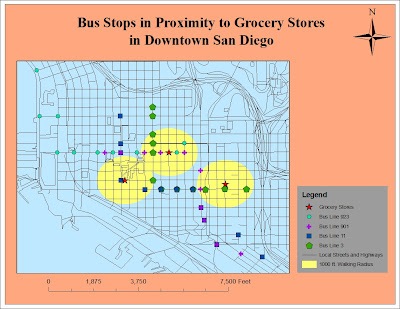
Figure 1: Map of Geocoded Bus Stops and Grocery Stores in Downtown San Diego


Table 1: Stops for Bus Line 3

Table 2: Stops for Bus Line 11

Table 3: Stops for Bus Line 901

Table 4: Stops for Bus Line 923

Table 5: Addresses for Grocery Stores


            For this assignment I geocoded the addresses of grocery stores and various transit stops in downtown San Diego. Since I am from San Diego and have observed the lifestyles and behaviors of people who live downtown, I thought I would try to solve a common problem. In many downtown areas, high density creates more obstacles for having a personal vehicle, such as traffic and lack of parking. Furthermore many of these residents live and work in this downtown area, further decreasing their need for a car. However, there are certain activities that can be difficult to do without a car, like grocery shopping. Therefore, I decided to geocode the addresses of three major grocery stores and four of the major bus lines that serve downtown San Diego.
            The bus stops and grocery stores were all geocoded in the context of the street system of downtown San Diego, which was obtained from 2009 Census data. The red stars represent the three largest grocery stores and the yellow buffer around each star represents a 1000-foot walking distance. This buffer displays the easy walking distance between each grocery store and several bus stops, which serve the majority of the downtown area. Furthermore, many of these bus lines overlap which provides easy transfer points for residents traveling to the outskirts of the region.
            Although this project may be irrelevant for savvy transit users, it communicates an alternative for residents who are still reliant on cars. For example, the manager of an apartment building in downtown San Diego may show this map to potential tenants in order to demonstrate transit as an effective alternative to cars, thereby decreasing the need for expensive parking structures for the apartment building. In order for public transit ridership to increase, the accessibility, convenience, and efficiency must be communicated to the general population. A common activity like grocery shopping can appeal to everyone. Therefore, by visually representing the close connections between grocery stores and transit stops, residents of dense urban centers may realize the advantage of public transportation over the hassle of using a car.

Citations:
"Topologically Integrated Geographic Encoding and Referencing system." U.S. Census Bureau. <http://www.census.gov/geo/www/tiger>.
"Maps and Time Tables." San Diego Metropolitan Transit System. <http://www.sdmts.com/map_timetable>.